Things That Make a Website Look and Feel Modern
When you land on a website, it either feels fresh or it doesn’t. The colors, the layout, the typography—even the way the buttons behave—can tell you if the site was built recently or a decade ago.
So, what exactly makes a website look and feel modern? Let’s break it down.
1. Clean, Minimal Design
Modern websites avoid clutter. Instead of cramming everything into one page, they give you breathing room. Think of a luxury fashion store. You walk in, and it’s open, simple, and every product has space to shine. That’s how a well-designed website should feel.
Look for:
- Lots of white space
- Clear content hierarchy
- No unnecessary graphics or animations
Minimal design doesn’t mean boring. It means focused. Whether you're running a logistics firm or a local bakery, a clean layout helps users find what they need fast.
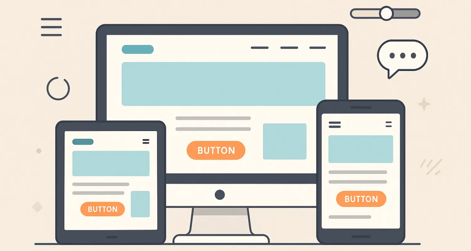
2. Mobile-First Experience
More than half of web traffic comes from mobile devices. If your website doesn’t adjust to small screens, you’re losing people. A modern website feels just as comfortable on a phone as it does on a desktop.
Mobile responsiveness is no longer optional. Whether you’re a top software development company or a small accounting agency, your clients expect mobile-friendly pages.
Key features of mobile-first design:
- Fluid grids
- Touch-friendly buttons
- Optimized images for faster loading
Try loading your site on your phone right now. Does it feel natural to use?
3. Modern Typography
Fonts say a lot. Outdated fonts can make your site look stale. Modern websites use clean, readable fonts—and they know how to pair them. Serif for headlines, sans-serif for body text? That combo still works.
Popular choices today include:
- Open Sans
- Inter
- Montserrat
- Lato
Typography also affects performance. Google recommends using system fonts where possible to reduce load time.
4. Thoughtful Use of Color
Color can make or break your site’s appeal. Many modern websites use a simple palette—usually one primary color, a secondary accent, and lots of neutrals.
Brands in Kenya often prefer bold but tasteful palettes. At our creative web design and development agency, we help businesses choose color schemes that are easy on the eyes but still memorable.
If you’re unsure, try these free tools to create a palette:
And remember: don’t go overboard. Stick to a consistent scheme across pages.
5. Fast Load Times
Nothing says outdated like a slow website. Users will leave if your site doesn’t load in 3 seconds or less. Modern websites are fast because they’re built smartly, with performance in mind.
Common practices include:
- Compressing images
- Minimizing CSS and JavaScript
- Using lazy loading
6. Microinteractions
Modern websites include subtle animations that respond to your actions. Hover effects on buttons, a bounce when you add something to the cart, or a little loading animation—these are called microinteractions.
They make your site feel alive, intuitive, and responsive.
Use them to:
- Highlight clickable areas
- Guide users through a process (e.g., during a payment integration)
- Show progress in forms
7. High-Quality Visuals
Stock photos can be okay—if they don’t scream "stock photo." But original images, especially of your products or team, will always win.
Modern websites use:
- Sharp, well-lit images
- SVG icons for crisp visuals
- Light video backgrounds (when needed)
A professional web design agency can help create visuals that match your industry, whether you’re in retail, hospitality, or manufacturing.
8. Clear Calls-to-Action
Visitors shouldn’t have to guess what to do next. Whether it's “Get a Quote,” “Book a Demo,” or “Call Us,” your website should guide users clearly.
Keep CTAs:
- Bold but not overwhelming
- Consistent in wording and color
- Positioned in logical places (top, middle, bottom of the page)
Modern websites guide users, not confuse them.
9. Real-Time Features
Modern doesn’t just mean how a site looks. It’s also about what it can do.
Think:
- Live chat support
- Real-time availability on bookings
- Instant payment confirmation
If your site supports payment integrations or live inventory tracking, users notice the difference.
10. Secure and Accessible
A modern site is secure (HTTPS) and accessible to all users, including those with disabilities. It's not just about compliance. It shows you care.
Check for:
- Proper contrast ratios
- Keyboard navigation
- Screen reader compatibility
Tools like WAVE can help you test accessibility.
Final Thought
Modern websites don’t just look good—they work well. Whether you run a growing business in Nairobi or serve clients worldwide, your website should reflect your standards.
Want a site that looks modern and feels right? Whether it’s a simple page, a full-featured web application, or an e-commerce website with payment integration, choose a team that understands both design and function.
Let’s make modern the default.