How to Choose the Right Color Scheme for Your Website
Colors do more than make your website look good. They shape people's feelings about your brand, influence their decisions, and even guide their actions.
If you’ve ever landed on a website that made you feel overwhelmed or confused within seconds, there’s a high chance color was involved.
So, how do you pick the right colors for your site, without guessing or copying someone else?
Let’s break it down.
Start With Your Brand Personality
What do you want people to feel when they interact with your website?
Is your brand bold and energetic? Calm and trustworthy? Playful and fun?
Color plays a major role in communicating this. For example:
- Red often suggests urgency or energy. It can spark action (think sales or limited offers).
- Blue is associated with trust and professionalism. That’s why many banks and insurance firms use it.
- Green can represent nature, wellness, or growth.
- Black signals luxury or exclusivity.
- Yellow brings warmth and optimism, but can also cause visual fatigue if overused.
Once you define your brand's tone, choose colors that align with it. Don’t just pick what looks nice.
Understand Color Psychology
Color psychology is the study of how colors influence perception and behavior. It’s not guesswork—it’s backed by real research.
In a study by the Institute for Color Research, people subconsciously judge a product within 90 seconds, and up to 90% of that judgment is based on color alone.
When designing your website, this insight can guide your color choices to attract and retain the right users.
Choose a Primary Color First
Your primary color should reflect your brand personality and dominate your design. This is the color people will associate with your business.
Once you’ve picked your primary, build a palette around it.
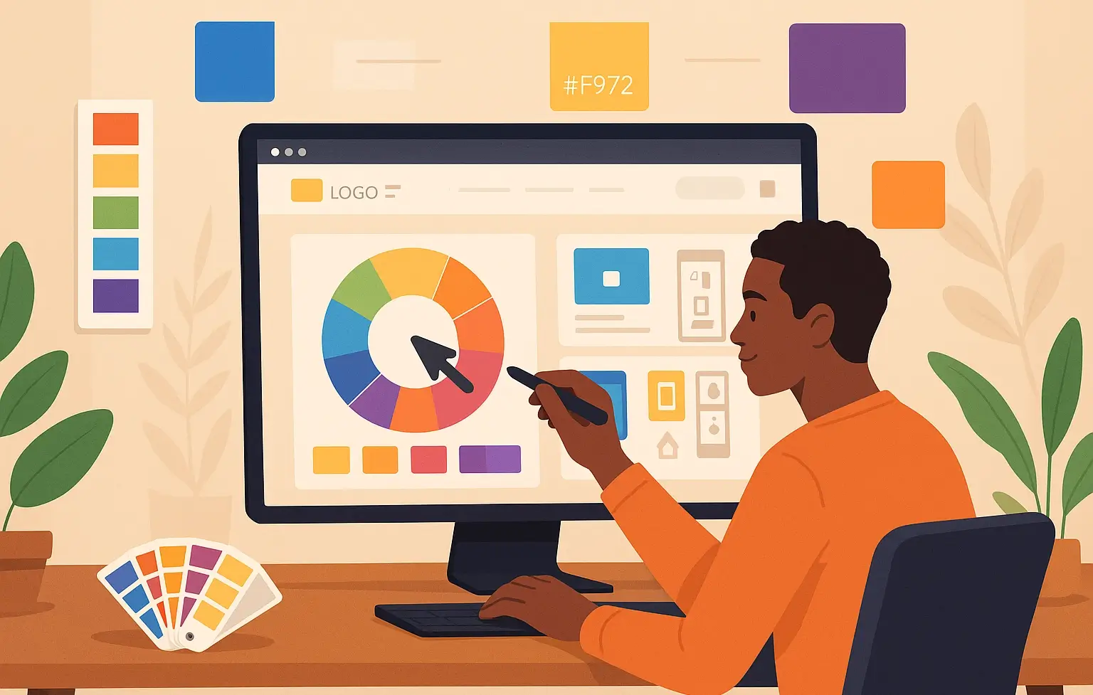
Build a Balanced Color Palette
A complete website color scheme typically includes:
- Primary Color: Your brand's anchor color.
- Secondary Color(s): Used for contrast or emphasis.
- Accent Color(s): Highlights, call-to-action buttons, or links.
- Neutral Colors: Backgrounds, text, and general readability (like white, gray, black, or beige).
Stick to 3 to 5 main colors. More than that, your website may feel messy.
Test for Readability and Accessibility
A color may look great, but if it reduces readability, it hurts the experience.
- Use high contrast between the background and text.
- Avoid neon colors for large areas.
- Test your combinations using WebAIM’s contrast checker.
Accessibility isn't just a good practice—it’s essential. It ensures everyone, including users with visual impairments, can interact with your content.
Consider Your Target Audience
Age, location, and culture influence how people perceive color.
For instance, white represents purity in some cultures, but mourning in others. A bold red website might appeal to younger audiences but could feel aggressive to older users.
If you’re a company offering services like web design and development or software development, you’ll want a palette that reflects trust, reliability, and professionalism. Subtle shades of blue, green, or dark neutrals are often a good fit.
Look at Your Competitors—Then Do Better
Browse websites in your industry. What colors do they use? What works, and what feels off?
You don’t need to copy their choices. Use their sites as reference points. Your goal is to stand out, not blend in.
Let’s say you run a tech company and all your competitors use dark blue. You might pick a different tone, like teal or forest green, to keep the trust factor while differentiating your brand.
Test and Adjust Over Time
Once your color scheme is live, see how people respond. Look at bounce rates, conversions, and time spent on the site. Run A/B tests with different button colors or section highlights.
Color is not a one-time decision. Like SEO or content updates, it should evolve based on data and user behavior.
Final Thoughts
Your color choices impact everything—from how users feel to how likely they are to click and trust you. When picked with purpose, color becomes more than decoration—it becomes a tool for connection.
And if you’re working with a company to handle web development, choose a team that understands not just code, but design psychology too.
After all, color isn’t just what people see. It’s what they remember.